Burnet Pharma
40 Years, Same Standard
Healthcare
About
Burnet Pharma has been a trusted name in Indian healthcare for over four decades: crafting solutions that embody care, precision, and continuity.
Location
India
Services
Brand Strategy
Visual Identity
Verbal Identity
Website design & Development
Print & Packaging
Social Media
STRATEGY
As they prepared for their next chapter of growth, we partnered with them to build a brand system that could carry both legacy and future, rooted in the most iconic form of healing: the pill.

IDENTITY
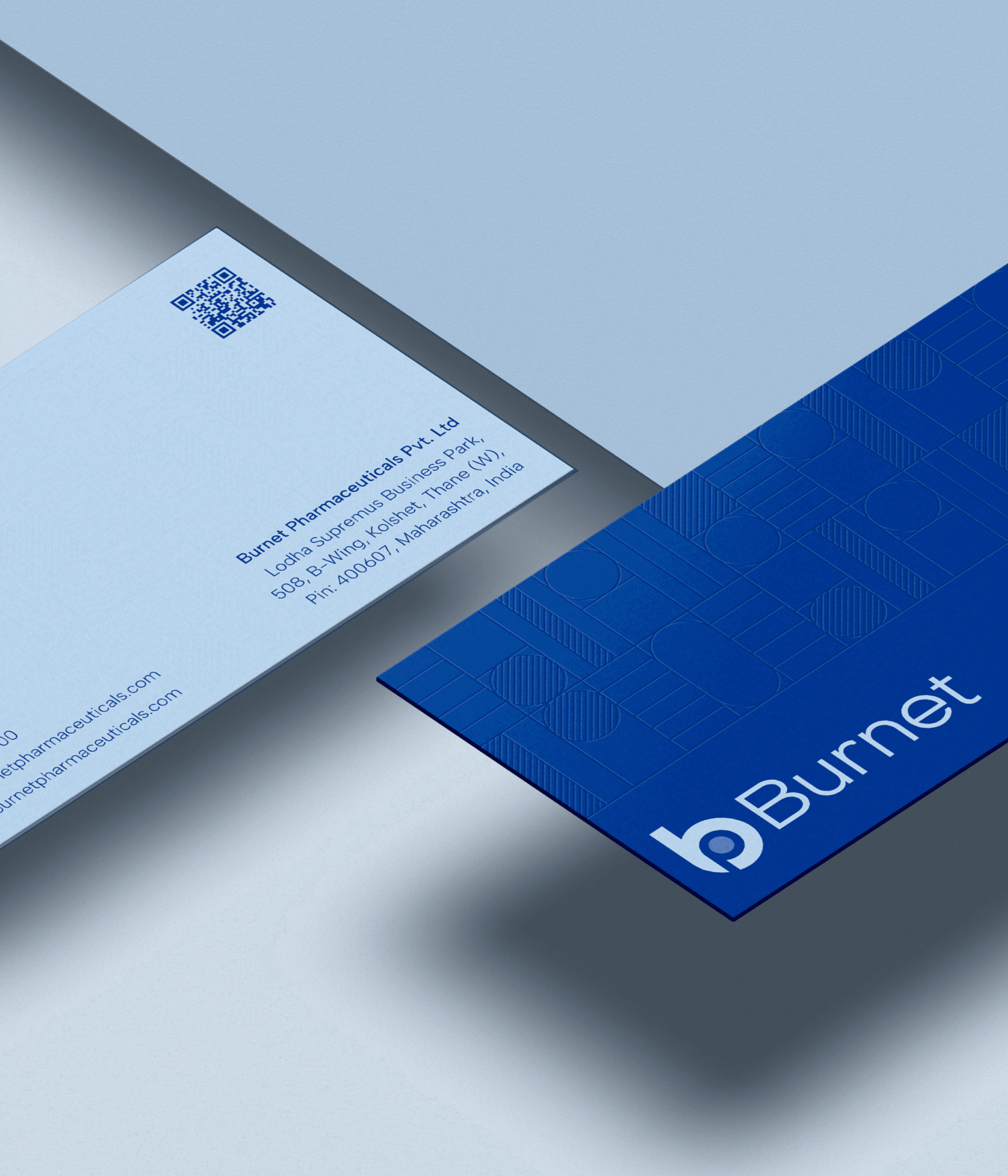
At the core of Burnet’s identity lies a visual system shaped by healthcare’s most iconic form.
Circular and capsule motifs echo across layout, motion, and interaction, offering consistency without rigidity.
The system is designed to scale with restraint, prioritising calm rhythm and structural clarity across every touchpoint.
Together, its elements form a brand expression that feels both grounded and forward-looking.



Digital
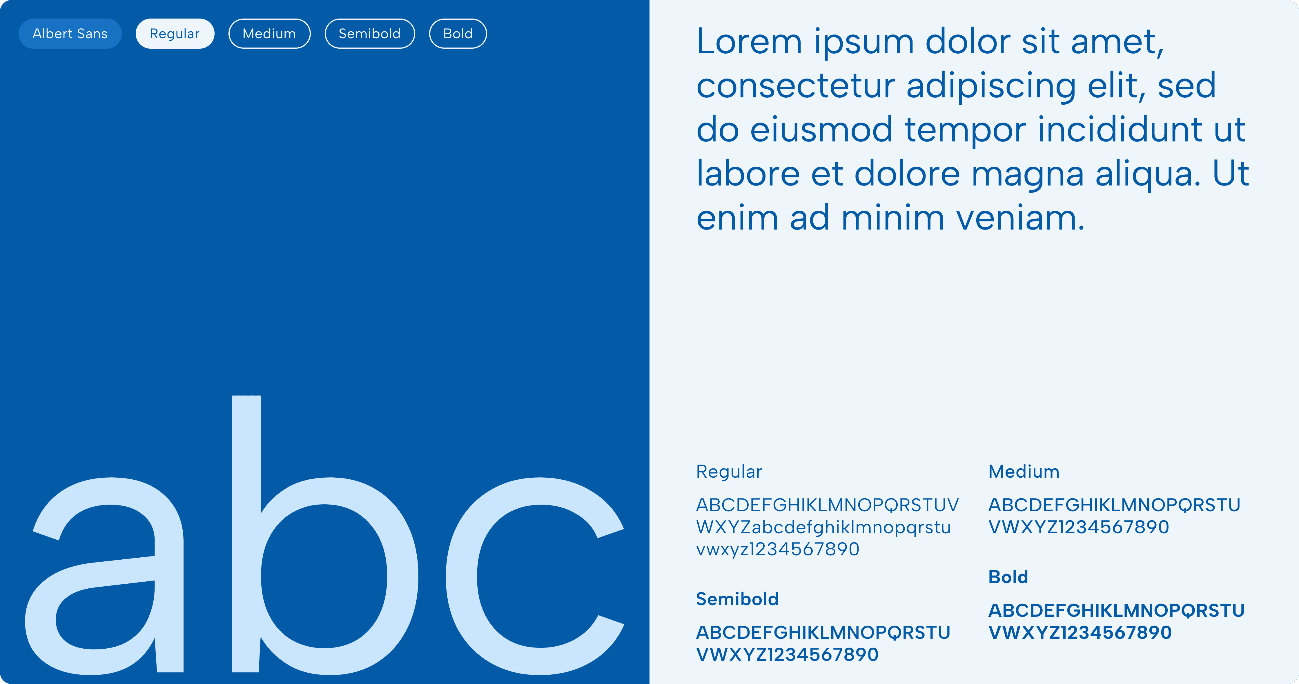
The digital experience draws inspiration from editorial simplicity: prioritising clarity, space, and a sense of ease.
It reflects Burnet’s belief in thoughtful communication, using structured layouts and deliberate pacing to guide attention.




Physical and Brand expirence
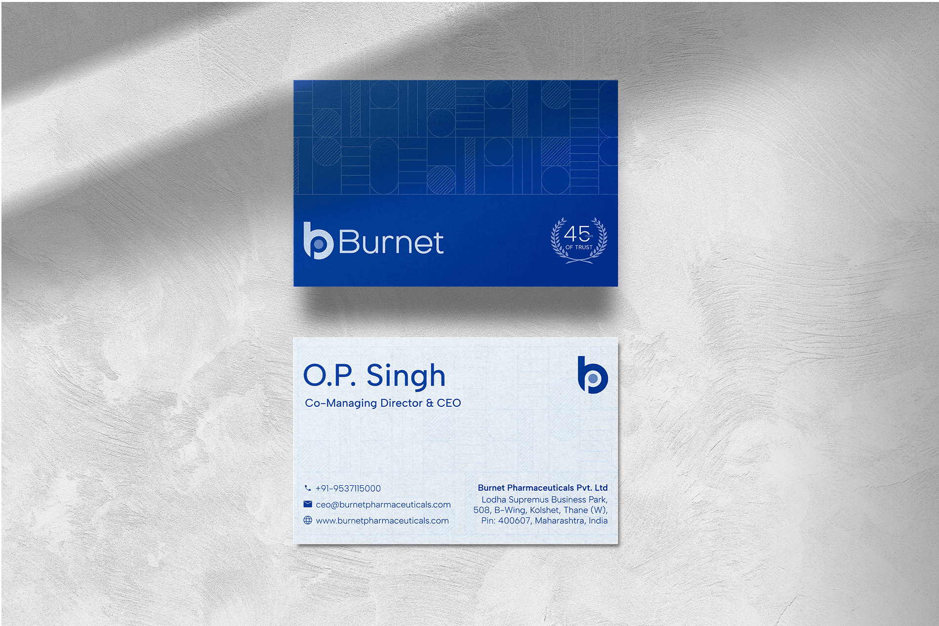
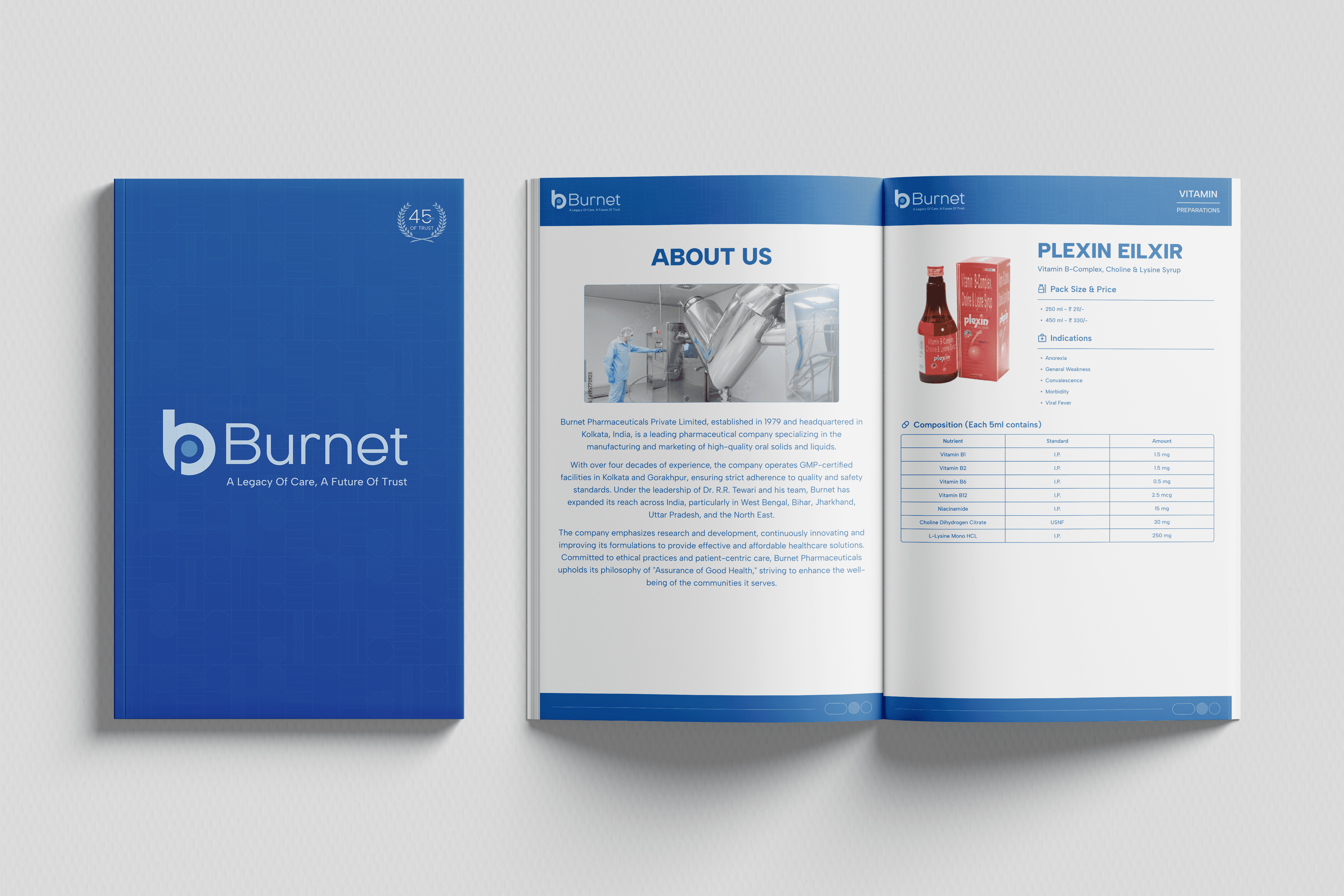
As the system took form, we refined how Burnet would appear in physical space.
The identity extended into brand books, brochures, and standees, each reflecting the structure and stillness of the visual system.




Outcome
A guest arrives carrying the drive, the traffic, the last email answered on the way. The first job isn't to impress them it's to slow them down before they notice it happening.
So every touchpoint was designed to ask for less attention than the one before. Direction cut into stone rather than printed on a board. Signage that reads at walking pace. The thinking is the same throughout: the more a property explains itself, the more work it hands the guest. Getting out of someone's way is a design decision, and it has to be made a hundred times to be felt once.

