Keekoo Stays
Luxury, Wherever Nature Is
Hospitality
About
Keekoo is a nature-first hospitality brand building glamping properties across India's landscapes; forest, water, hill. Each site is designed to sit lightly in the place it's in, so no two feel the same. What holds them together is how it feels to arrive.
Location
India
Services
Brand Strategy
Visual Identity
Website Design & Development
Verbal Identity
Uniform & Merchandise
Guest Experience Design
Challenge
How does a brand stay recognisable when no two properties look alike?
Each stay belongs entirely to where it is and that's the point. But what they remembered was the place, not the brand that made it. They remembered the sunset, the bonfire, the staff by name. Keekoo had grown property by property. A guest who loved one had no reliable way to find the next.
STRATEGY
Most hospitality brands stay recognisable by looking the same everywhere. Keekoo couldn't do that without erasing the reason people come.
So consistency had to come from restraint, not repetition colour drawn from each landscape rather than imposed on it, a mark abstract enough to belong in snow, sand or forest. What's constant isn't a look. It's the feeling of arriving somewhere that asks nothing of you.


RESEARCH
We stayed at the places Keekoo competes with domes in Kanatal, boutique properties in Rajasthan, the ones people book off a single photograph.
The pattern showed up fast. Everyone was selling a view, a fire and a private dinner. Nobody was selling what people actually described afterwards, which was never the amenity it was the moment the noise stopped.
That gap became the brand. The Indian traveller has shifted from wanting to be somewhere impressive to wanting to be somewhere unhurried, and the category hadn't caught up.


IDENTITY
The properties had nothing visual in common, and never would. So the identity had to be built on something that could travel.
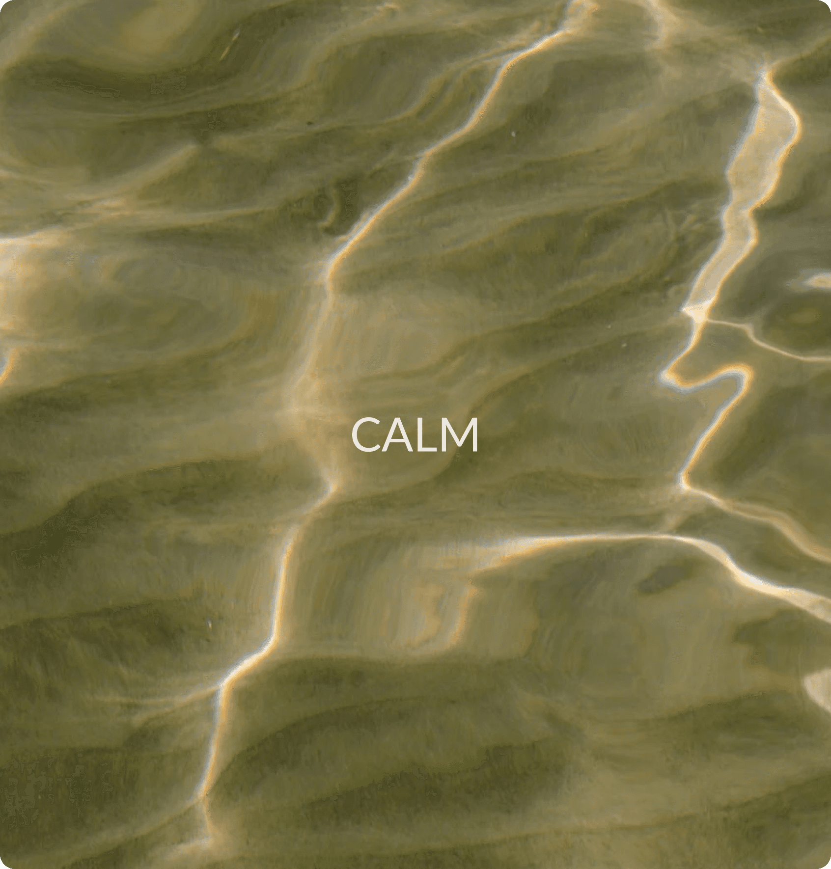
Restraint was the idea. Colour taken from the ground rather than applied to it, a mark simple enough to hold still in any landscape, type that stays out of the way. Every choice began with what could be removed. The brand arrives quietly and lets the place do the talking which is what guests came for in the first place.




Physical assets & Guest experience
A guest arrives carrying the drive, the traffic, the last email answered on the way. The first job isn't to impress them it's to slow them down before they notice it happening.
So every touchpoint was designed to ask for less attention than the one before. Direction cut into stone rather than printed on a board. Signage that reads at walking pace. The thinking is the same throughout: the more a property explains itself, the more work it hands the guest. Getting out of someone's way is a design decision, and it has to be made a hundred times to be felt once.


Digital
Here comes the headline
Someone finds Keekoo at eleven at night, tired, half-deciding whether they can afford three days away. That's the condition the site had to work in not curiosity, exhaustion.
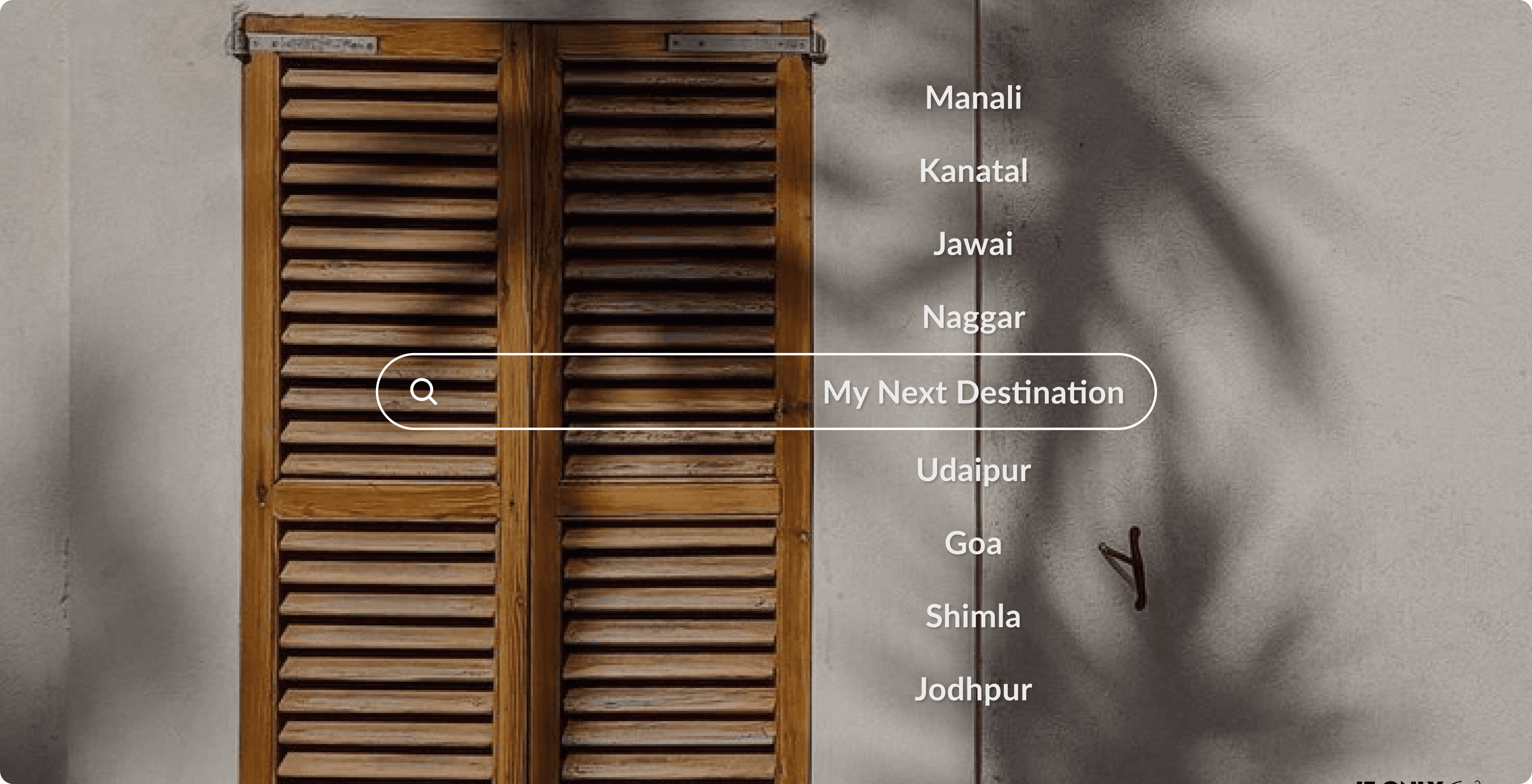
So it was built to shorten the distance between wanting a break and booking one. Icons carry what a paragraph would slow down; everything else answers the question before it's asked. One measure throughout: how few decisions can this take



Outcome
Most hospitality brands stay recognisable by looking the same everywhere. Keekoo couldn't do that without erasing the reason people come.
So consistency had to come from restraint, not repetition colour drawn from each landscape rather than imposed on it, a mark abstract enough to belong in snow, sand or forest. What's constant isn't a look. It's the feeling of arriving somewhere that asks nothing of you.

